Collate Assets & Reviewing File Types
The next step is gathering all the bits and pieces you’ll need for your design and putting them in one easy-to-find spot. It sounds boring, but doing this prep first will save you a heap of frustration later. Think of this like cooking: before you start, you need to lay out all your ingredients so you’re not running around looking for them halfway through. Same with design.
When we work with clients, we create a brand assets folder in Google Drive that holds all the essentials:
- Brand guidelines
- Logos
- Fonts
Because it’s online, it’s easy to share with collaborators, media, or even a printer.
Why Google Drive? It’s free with a Gmail account, super simple to preview, share and store files, and cheaper than Dropbox. It also saves you the extra admin of sending WeTransfer links. But you can use any cloud service you wish — many corporates prefer to keep everything in the Microsoft suite, which would mean OneDrive. This is all about collating assets once, and having them handy for yourself or anyone else, no matter where you are.
What to collate for your Brand Assets Folder
1. Brand Guidelines
- Think of this as your brand’s rule book: what colours to use, what fonts to use, and how the logo should (and shouldn’t) appear.
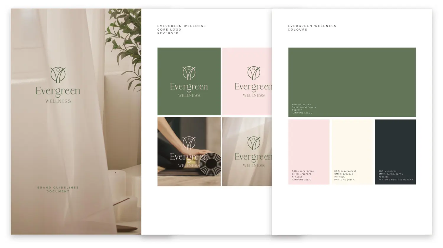
- Check out this example of a traditional Brand Guidelines document for Evergreen Wellness.
- Don’t have one? No problem. We’ll help you create one later in the course.
2. Logos
Ideally, you’ll want five versions stored in your brand assets folder. Step through them:
1 of 5 · the master
Vector file — EPS or AI
The Source file. The master working file a design was actually built in — layered, editable, and the one every other version is exported from. Each Adobe app has its own: AI from Illustrator (logos, graphics), PSD from Photoshop (photos, imagery), INDD from InDesign (booklets and multi-page layouts). If you only keep one file safe, keep this one. You may never open it yourself — your next designer will. of your logo, created in Adobe Illustrator — scalable to any size without losing quality, and editable in Illustrator. (Adobe Suite is still the industry standard.)
The downside: these aren't compatible with Canva directly, because Canva doesn't currently support editing vector files. But this is the master everything else comes from — export a PNG, a black-and-white version, whatever a job calls for.
An EPS or AI can also be saved as a PDF. One big caveat: exporting any old file as a PDF does not magically make it an editable vector. A PDF is only a vector if vector artwork went into it — a JPG wrapped in a PDF is still a JPG.
2 of 5 · the workhorse
Full-colour PNG, transparent background
Ideal for digital or print designs created in Canva. The transparent background lets you place the logo over any colour or image.
An understanding of resolution is required — a PNG is still made of pixels, so a version that looks fine on screen can print soft. For print work, make sure it’s big enough to sit at 300 dpi at its printed size — and when in doubt, ask for a larger one than you think you need.
3 of 5 · the editable one
SVG
A true vector like the AI file, but the one vector format Canva will actually open and edit — recolour it, scale it to anything, and it stays crisp. Worth asking for alongside the PNG.
One caveat for print: SVG is a screen-first format, so professional printers will still want the artwork as PDF, EPS or AI. Use the SVG for day-to-day Canva work, and let anything going to press come from the vector source file.
4 of 5 · when colour is off the table
Black and white
A simplified monochrome version. Works well when full colour isn't suitable — single-colour printing, engraving, newsprint, or a sponsor strip where every logo runs in black. Ideally you'll have this in both vector and PNG.
5 of 5 · for dark backgrounds
Inverse — the white logo
A white version of your logo, usually placed on dark backgrounds to ensure visibility — over photography, on dark packaging, in a website footer. Ideally you'll have this in both vector and PNG.
Which file do I need?
File types stop being confusing the moment you stop memorising them and start asking what kind of asset you’re holding. Logo files, print-ready collateral and digital assets each have their own right answer — and they’re not interchangeable:
AI Adobe Illustrator · EPS Encapsulated PostScript · SVG Scalable Vector Graphic · PSD Adobe Photoshop · INDD Adobe InDesign · PNG Portable Network Graphics · JPG Joint Photographic Experts Group · PDF Portable Document Format
Confused about file types? We've put the whole raster-versus-vector question on one page — what comes out of Photoshop, what comes out of Illustrator, and which one to ask your designer for. Print it and keep it by the desk.
Get the sheet →Raster
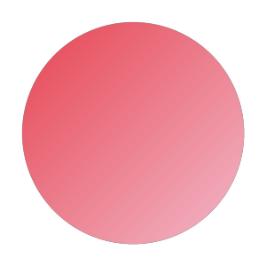
300 × 300 pixels. Crisp at 1:1 — but those 90,000 squares are all it will ever have, and more pixels = heavier files.
Vector
A path and a gradient. Redrawn from its instructions at any size — and lightweight, because it stores the recipe, not the pixels.
An EPS or AI can also be saved as a PDF. One big caveat: exporting any old file as a PDF does not magically make it an editable vector. A PDF is only a vector if vector artwork went into it — a JPG wrapped in a PDF is still a JPG.
Why can’t a photo just be a vector?
It comes down to layers — the way design work is actually built.
Open any design program and you aren’t painting one flat picture. You’re stacking layers: think sheets of clear film, laid one on top of another. In the scene below, the sky is painted on the bottom sheet, the hill sits on the next, the sun above that, and the type rides on top. Every sheet stays separate and every sheet stays editable — a designer can move the sun without repainting the sky, or recolour the hill without touching the type.
Now look at what’s actually on each sheet: one shape, filled with one colour or gradient. That’s all. Simple enough that the whole picture can be written down as a short recipe of instructions — draw this path here, fill it with this red, put this on top. That recipe is what a vector file is. It’s why a vector scales to any size and stays so lightweight: the file stores the instructions, not the picture.
A photograph is the opposite. It arrives as a single flattened sheet — no layers, and nothing on it you could pull apart. No shapes, no flat colours to name; just millions of pixels, every one its own slightly different colour reading. There is no recipe to write. The only honest way to store it is to record every pixel, which is exactly what a raster file (JPG, PNG, TIFF) does.
If you don’t have a logo…
We’ll go into logos in more detail later in the course, but here’s the short version: your best option is to have a specialist designer create your logo in Adobe Illustrator (part of the Adobe Suite). That way, you’ll get a proper vector source file – the professional standard that everything else can be exported from.
If you’re a startup or small business on a tight budget, creating a simple logo in Canva is fine to begin with. Just know that at some point, as your business grows, you’ll need to invest in a vector version — which is not only editable, but the industry standard requirement for any printing. More on that later.
3. Fonts
- Fonts come as OpenType Font. The modern standard, developed by Adobe and Microsoft. Works on Mac and Windows alike, and can carry extras like alternate characters, ligatures and multiple weights inside a single file. or TrueType Font. The older format, from Apple and Microsoft in the late 1980s. Still works everywhere — it just holds fewer of the typographic extras an OpenType file can. files. Store your company fonts in your online folder, and upload them to Canva so you can use them in your designs (if they’re not already there).
- Free option: Google Fonts has loads of commercial-friendly choices.
- If you don’t have fonts yet, don’t stress – we’ll help you choose later.
If you don’t have the font files: Canva fonts are fine for beginners, but long term you may need to buy proper font files for use outside Canva (e.g. product packaging).
What to collate for your Design Brief
Imagery and Graphics
Collect any images or graphics you think you may need for your design, such as:
- Icons or illustrations
- Product shots
- Lifestyle photos
For print: make sure the resolution is high enough to avoid blurry images.
Not sure if an image is high enough resolution? How to check it, what the file size tells you, and the two rules of resizing — on one printable page.
Get the sheet →Low resolution
12 × 12 = 144 pixels
Fewer, bigger pixels. Only 144 squares to hold the whole picture. Enlarge it and there is nothing extra to draw with.
High resolution
48 × 48 = 2,304 pixels
More, smaller pixels. Sixteen times the data for the same picture at the same size on the page.
You can also include links to any image libraries if you don’t have the final images yet – you can select the exact visuals later as you work on your design. See our examples below for Evergreen Wellness.
Assignment: Build your Design Brief, cont.
For this step, we’ll continue building your Design Brief document.
Step 2: Add your Links to Essential Assets
Add links in your Design Brief to your online brand folder. Include:
- Your Brand Assets Folder
- The imagery/graphics for your design brief
Having everything in one place makes the design process much smoother for you, and if you’re collaborating with others, they can access the files easily without chasing anything down.
If you’re following along with our Evergreen Wellness mock project, we’ve already provided a sample folder so you can see how neat and organised this looks in practice, along with the relevant links for your Design Brief:
Brand Assets Folder: Evergreen Wellness — brand assets
Images and Graphics for Design Brief: Evergreen Wellness — imagery